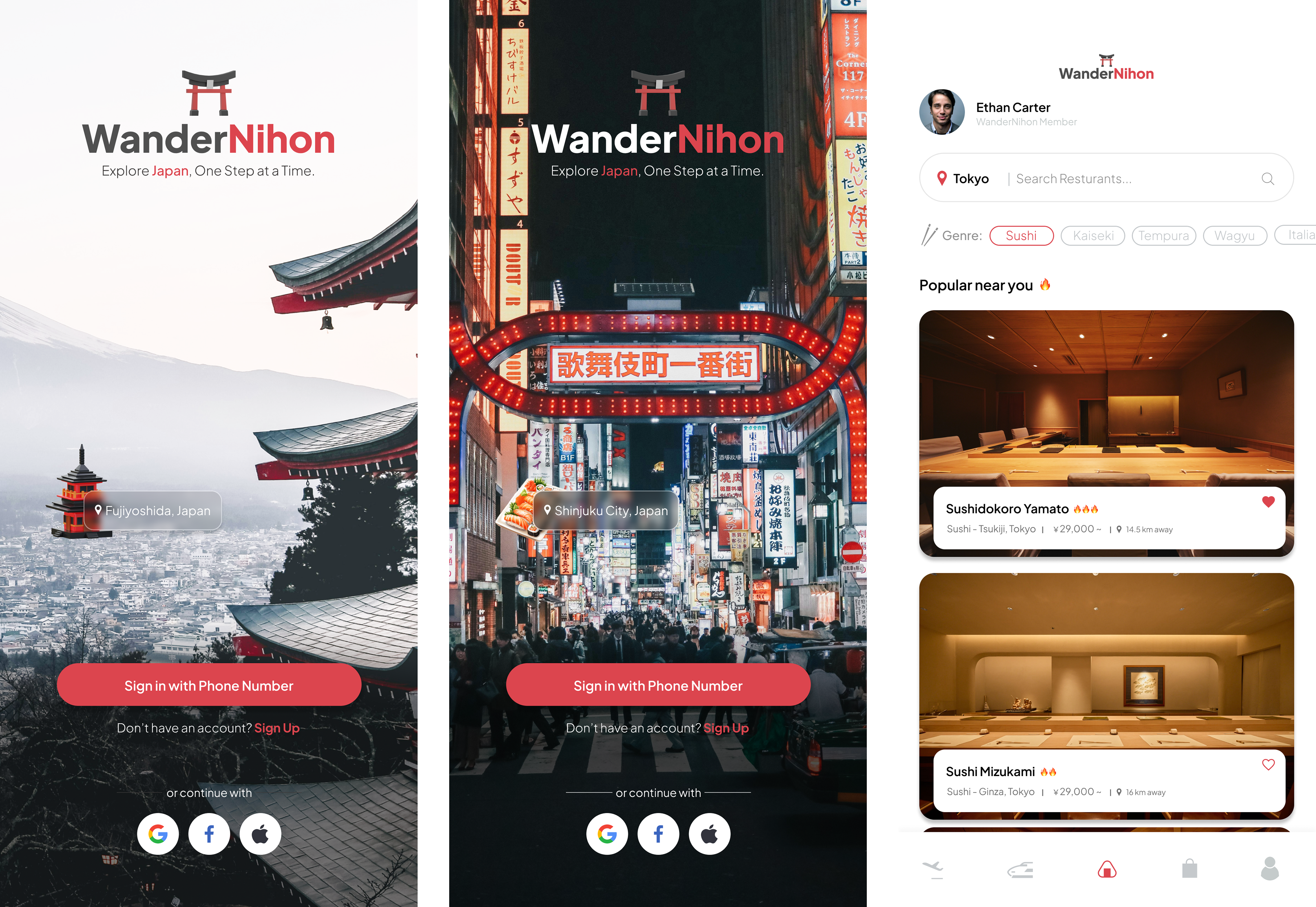
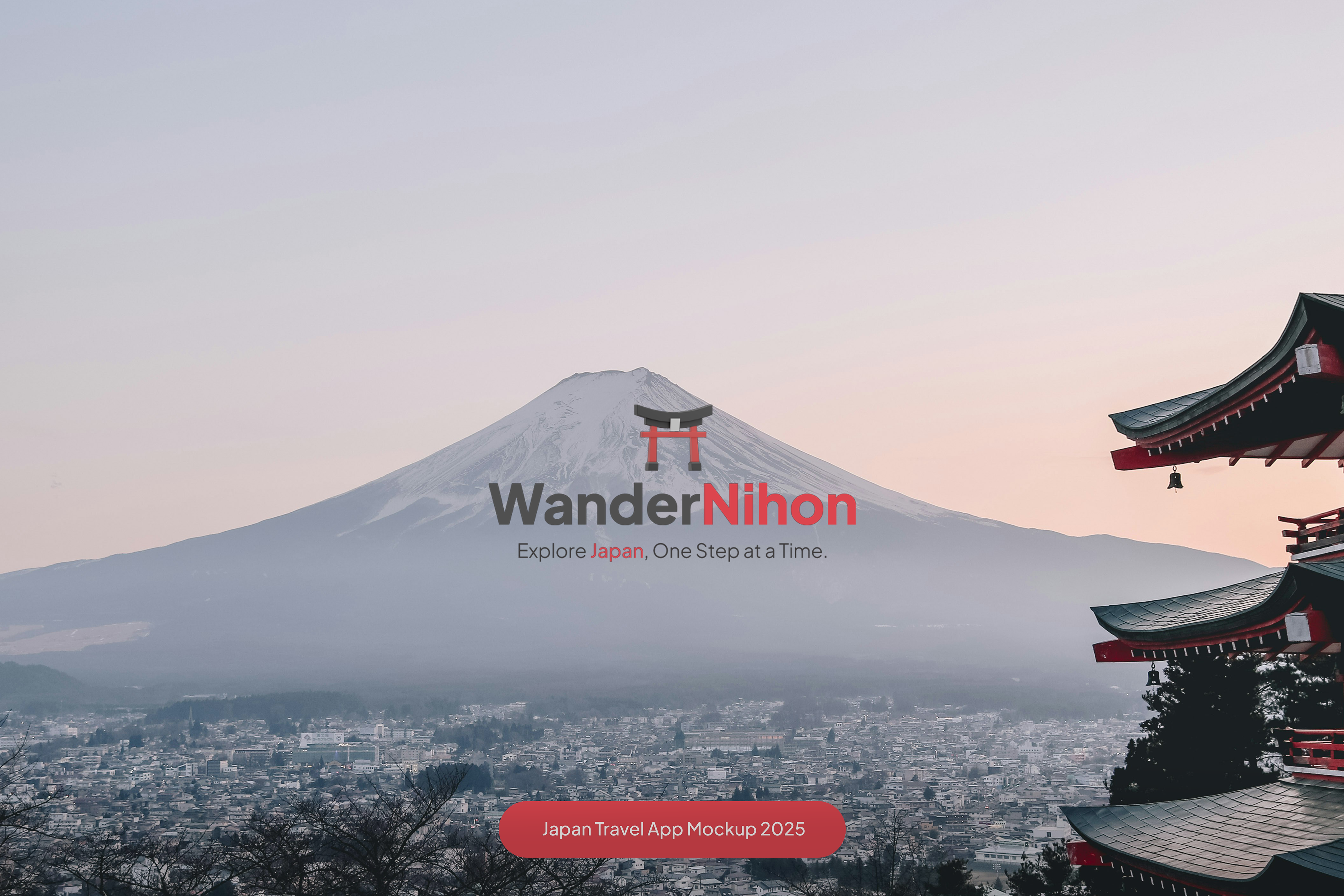
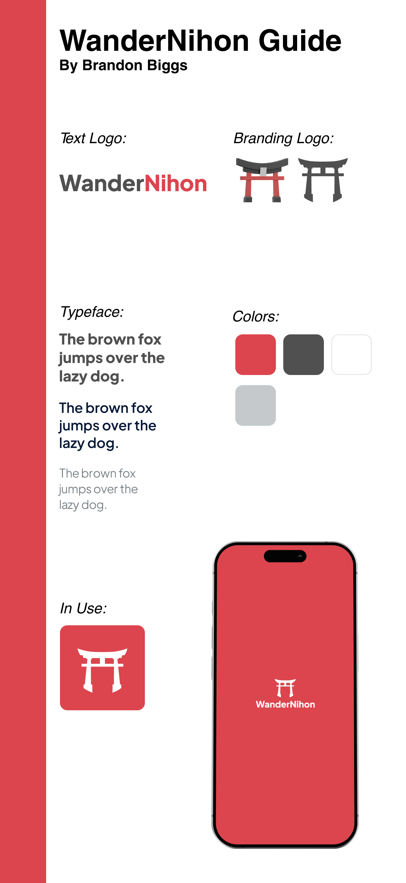
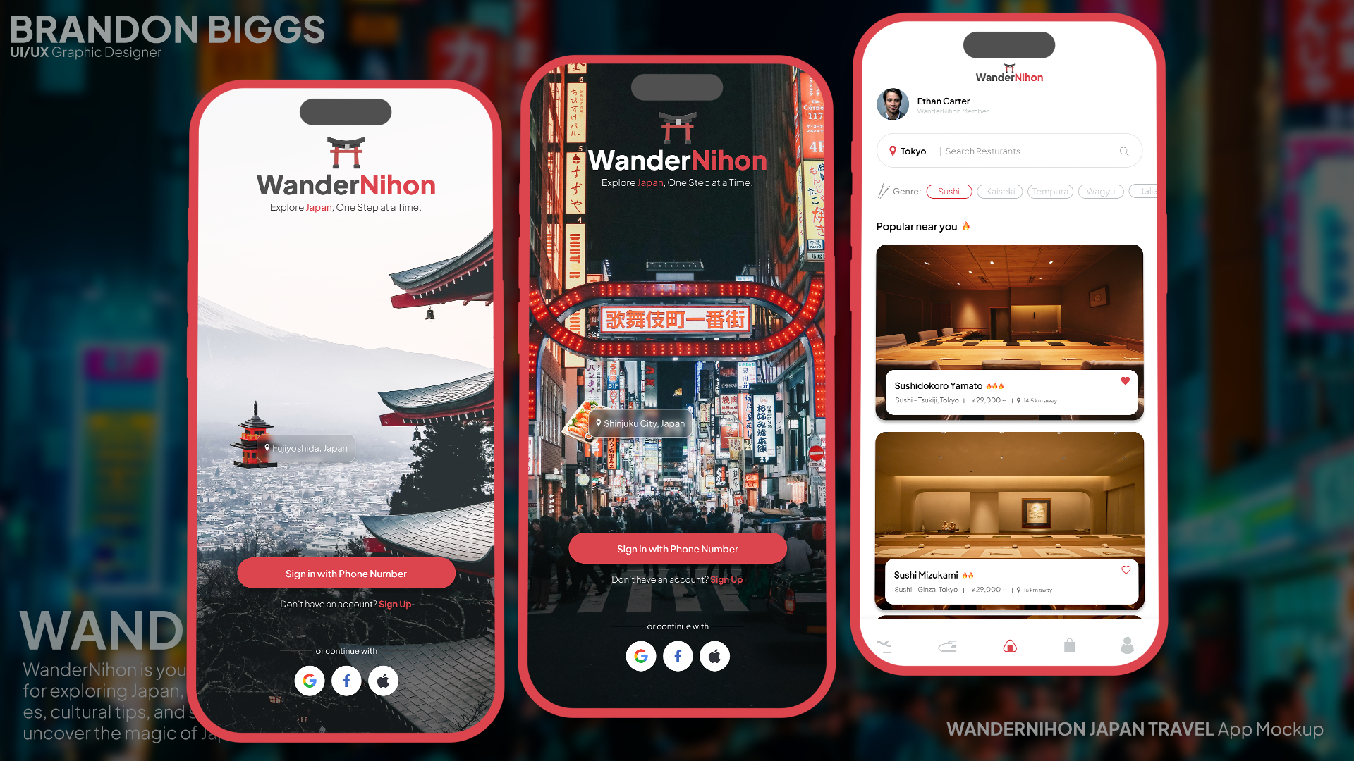
WanderNihon’s identity guide takes inspiration directly from Japanese culture and travel. The text logo highlights “Nihon” in red to instantly tie it to Japan, while the branding logo is a simplified torii gate — a recognizable symbol of Japanese tradition and exploration. The color palette uses strong reds and dark grays for contrast, paired with lighter gray for neutrality. This mix balances the adventurous feel of travel with the stability of a reliable guide app. The chosen typeface is clean and easy to read, designed to hold up in both app UI and promotional material, ensuring consistency across use cases. The application mockup shows how the brand translates to a phone icon and launch screen, giving it a bold and recognizable presence. The identity communicates travel, discovery, and cultural respect while still feeling modern and easy to use.